
Since reading Chip Kidd’s The Cheese Monkeys at age 15, I have dreamed of working in cover design. Kidd’s innovative approach and prolific work inspired me to pursue a career in graphic design, leading me to attend art school and dedicate myself to designing book covers whenever possible. The following is a compilation of self-driven projects and work for independent authors.
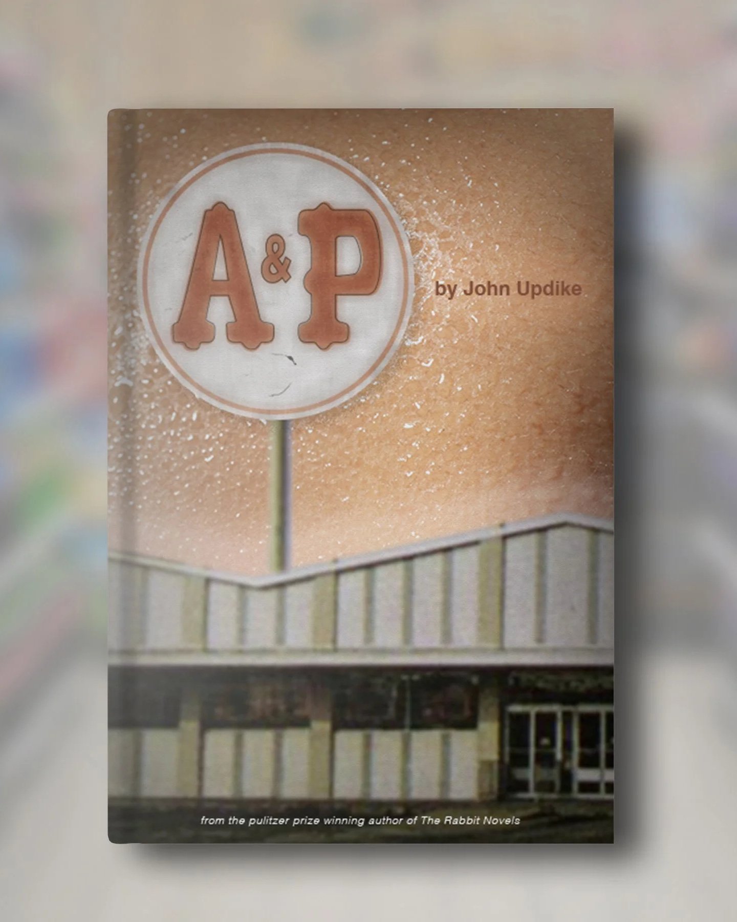
Self-directed cover design for John Updike’s short story A&P, originally published in The New Yorker on July 22, 1961. The design draws on the story’s setting and point of view, using a period-accurate A&P storefront to allude to “Queenie’s” bathing suit top against a field of skin. The composition mirrors Sammy’s fixation and the charged imbalance between observation, desire, and consequence, anchoring the narrative in a single, symbolic image.
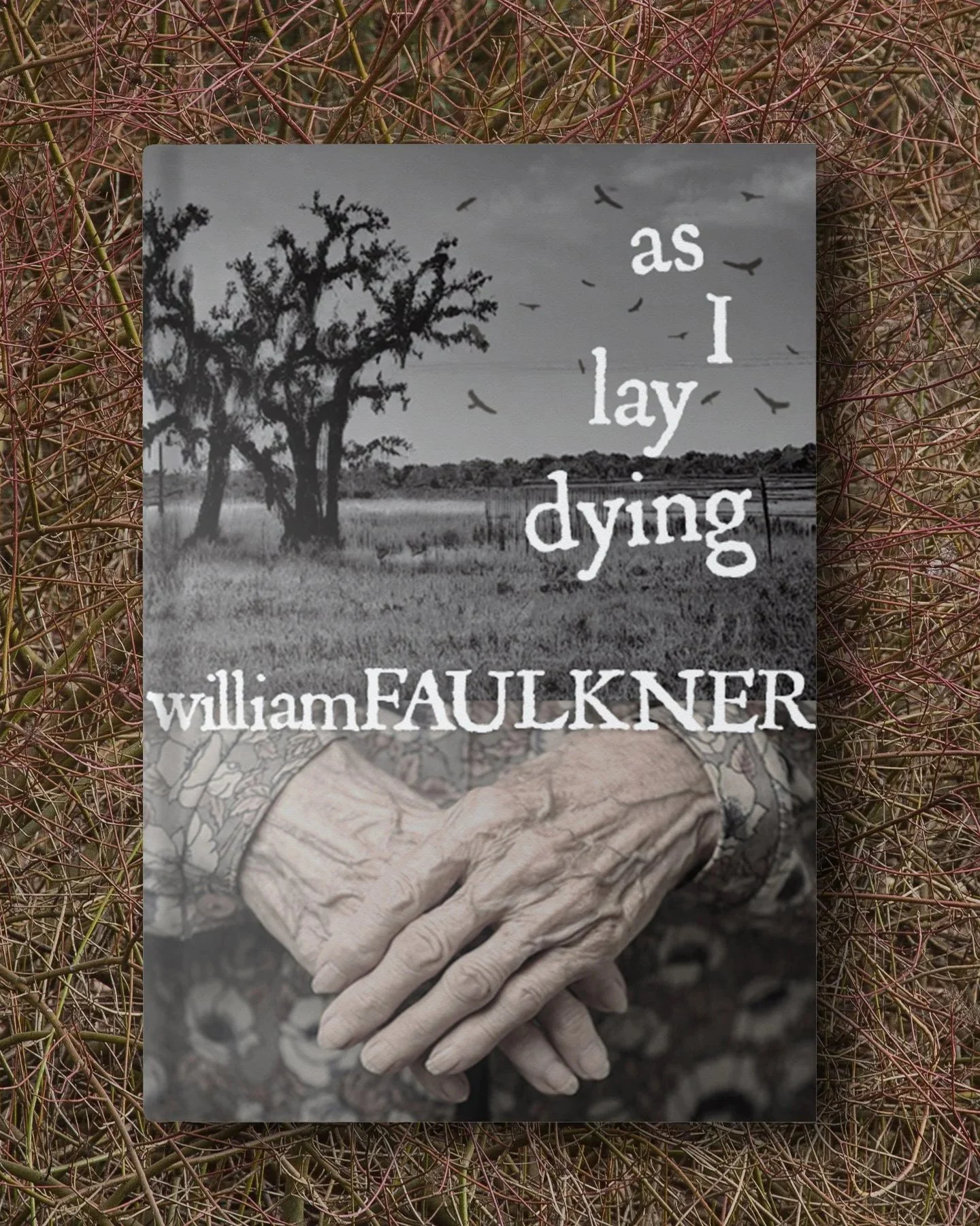
A self-driven cover design for a book I absolutely hated. William Faulkner's As I Lay Dying is renowned for its rich and vivid visual imagery, contributing to the novel's powerful and immersive atmosphere. Drawing on the novel’s central themes of death and decay while also highlighting the rural setting, the cover is meant to evoke the isolation and hardship faced by the Bundren family on their trek to bury their matriarch.
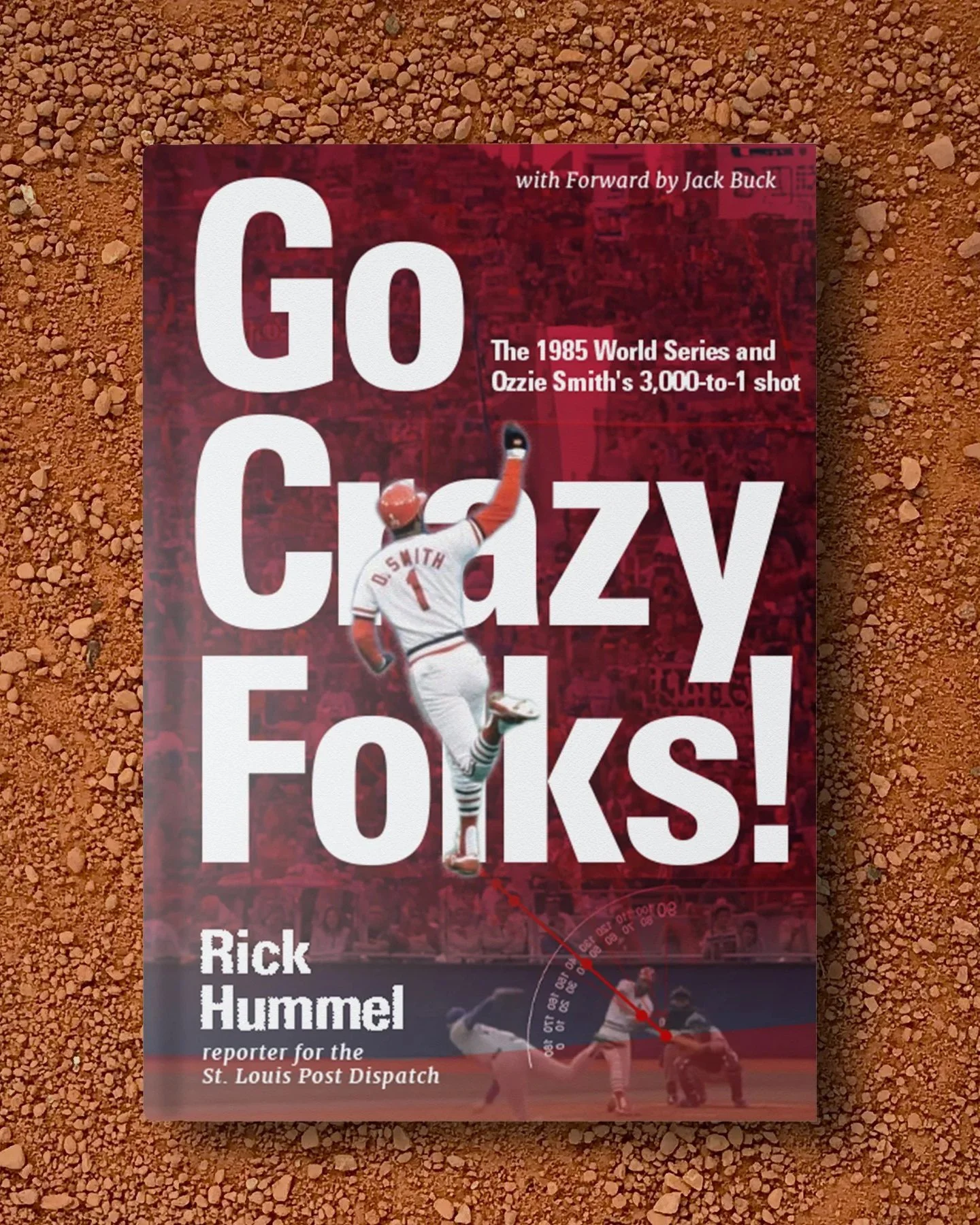
Self-directed cover design for a non-fiction title chronicling the 1985 World Series, anchored by Ozzie Smith’s iconic hit in Game 5 of the NLCS. The design centers on momentum and myth, treating the moment as catalyst rather than recap.
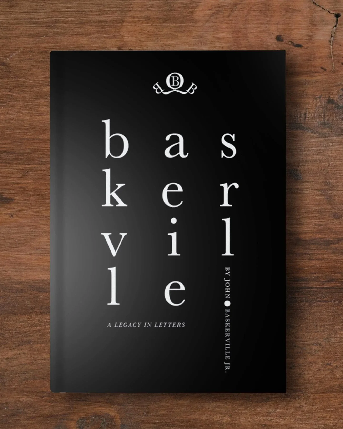
Self-directed design for a biography of John Baskerville, 18th-century typefounder and printer. Informed by Baskerville’s own typographic principles, the design privileges restraint, generous margins, and the expressive use of white space. Minimal ornamentation keeps the focus on form and proportion, with a deckle-edge binding proposed as a material nod to the period.
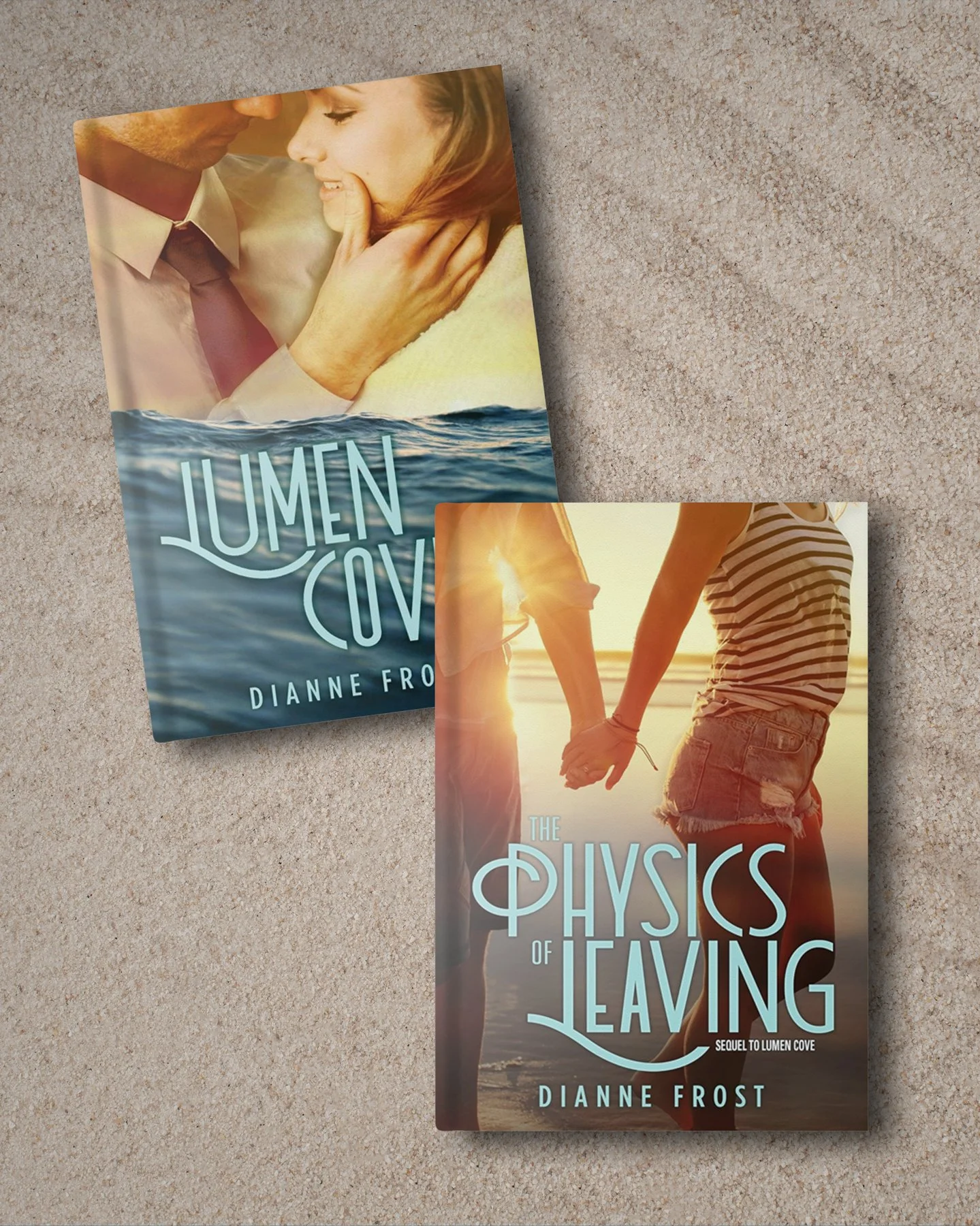
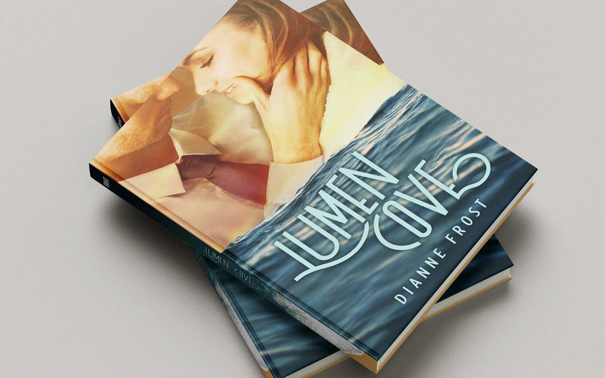
Cover designs for the Lumen Cove series by Dianne Frost. Set in a coastal environment, the covers use rising water as a shared visual motif, reflecting relationships and decisions that escalate beyond control. Intimate imagery is paired with restrained typography, allowing the metaphor to carry the weight.
The result is a cohesive system that signals tension, romance, and consequence without explanation.